Quarterly Earnings Presentation Design
Earnings presentation design isn’t just about getting the numbers right. These presentations are about delivering a story that compellingly conveys your business performance.
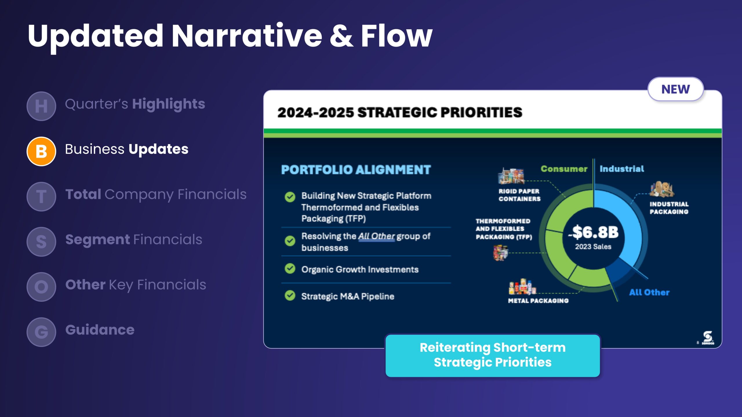
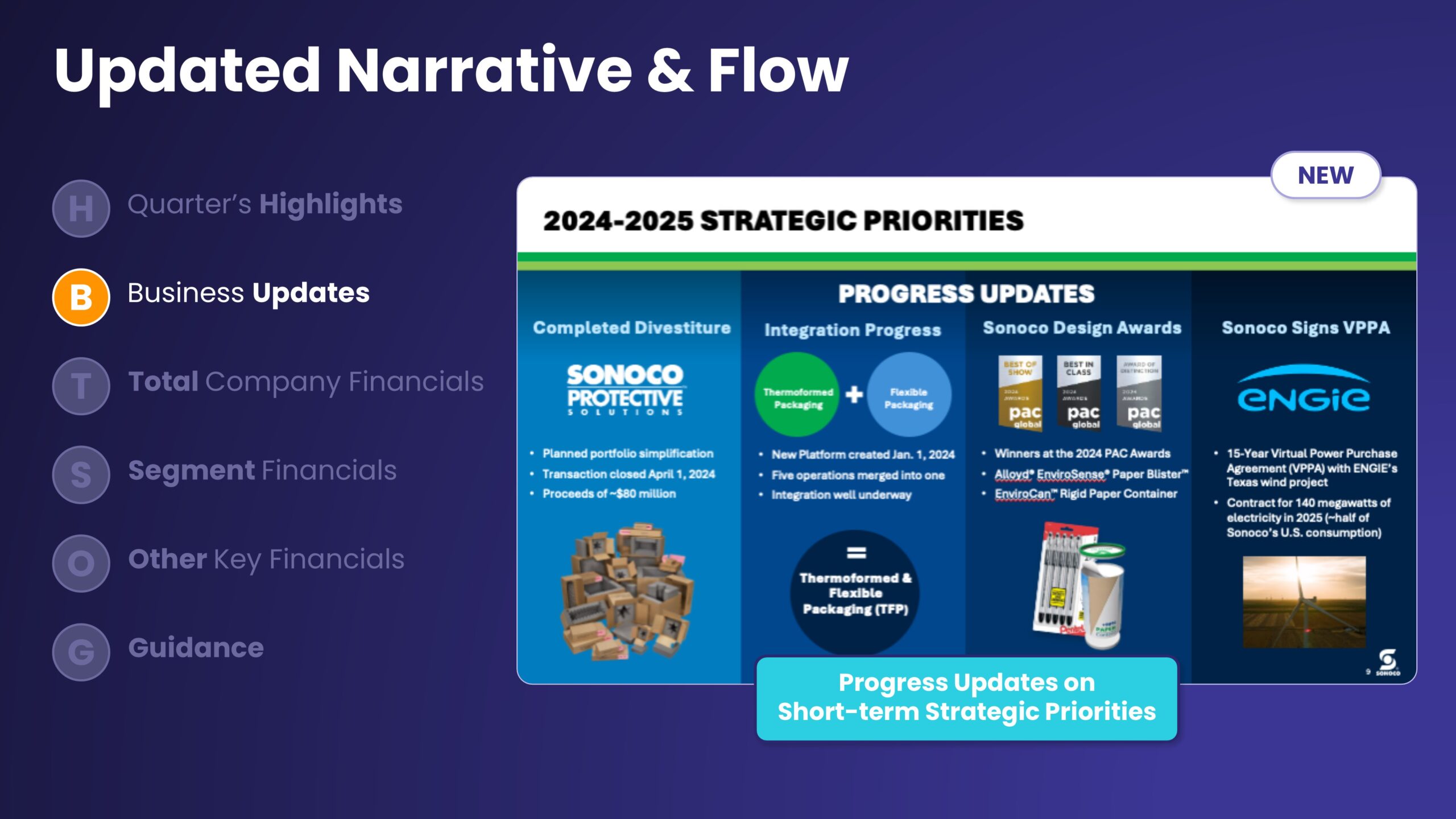
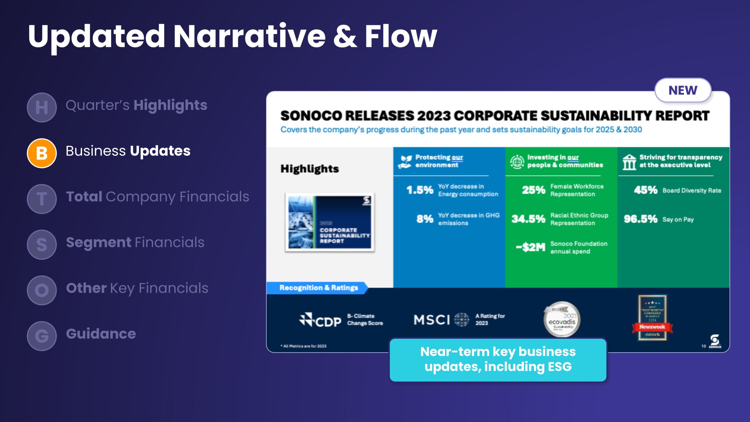
And while data will always be central to earnings slides, you can’t forget the story you’re trying to tell. Structuring your deck around a narrative makes it easier to contextualize your performance, especially during the not-so-good times.
Turn your earnings story into a clear, credible narrative for analysts and investors
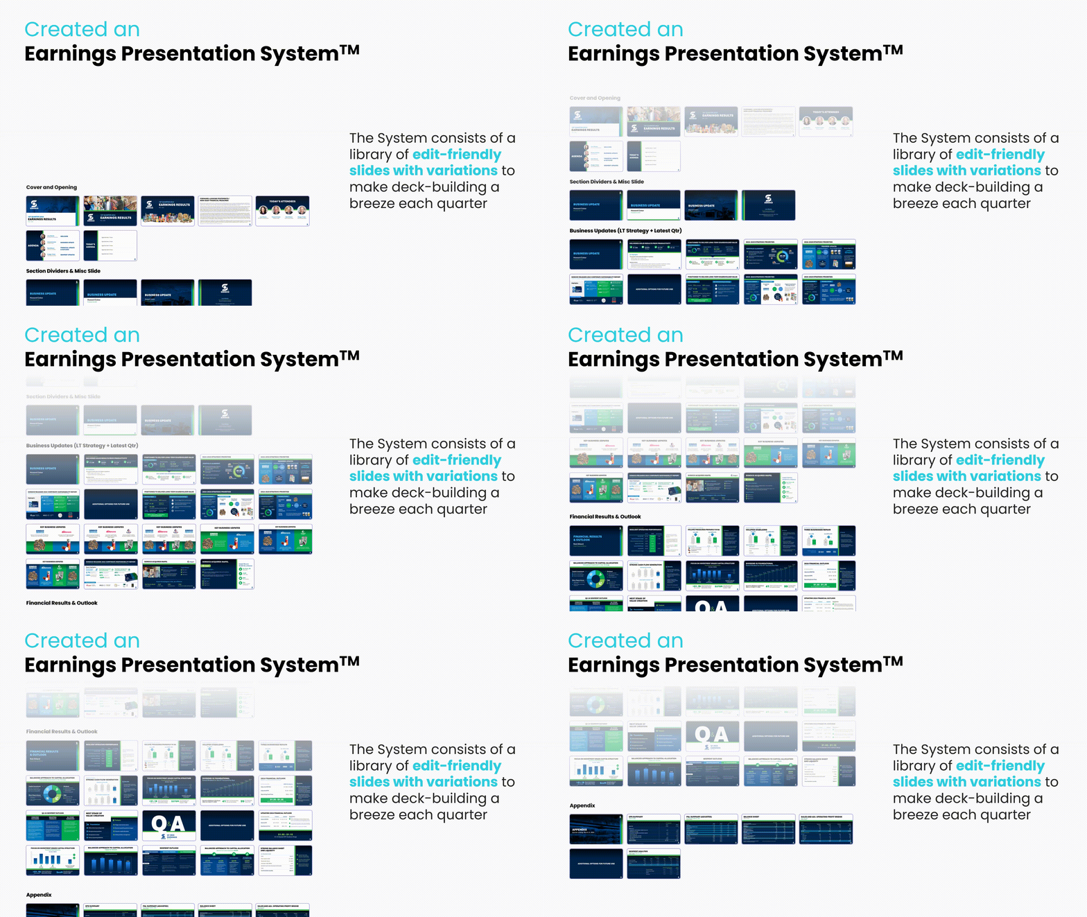
You need something flexible enough to accommodate a mix of data and story. It must also be easily adaptable to reflect changing performance stats each quarter.
At Outkreate, we’ll work with you to design an enduring, versatile Earnings presentation that gives Management many ways to use your deck. Whether you want to refer to slides during Earnings calls or create a leave-behind for analysts and investors, we’ve got you covered.
Ready for an earnings presentation that works? Book an introductory call or explore how we approach these presentations below.

What's New
TE Connectivity’s 2025 Investor Day Presentation
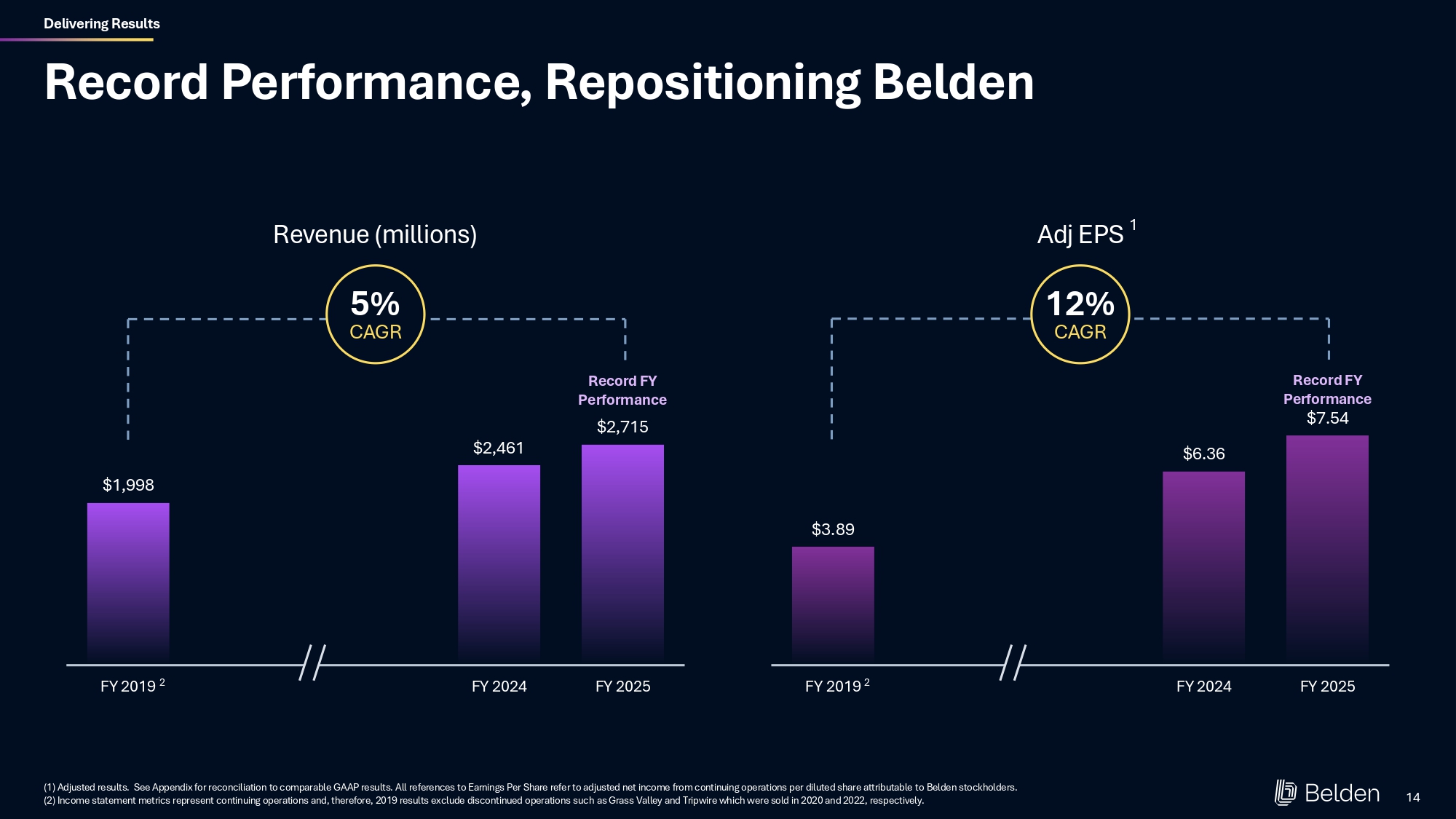
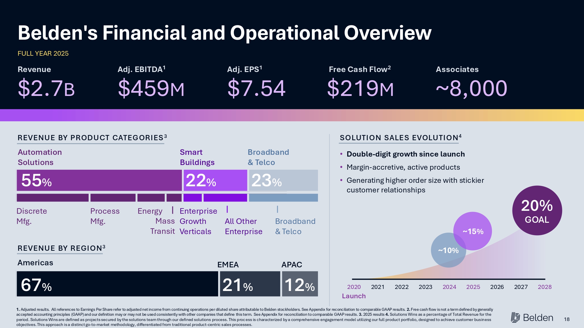
TE and OUTKREATE partnered to elevate TE’s investor story. Together, we clarified the value creation narrative, streamlined executive messaging, and designed a clean, tech-forward presentation system that helped leadership communicate strategy and performance, with clarity and credibility.
Trusted by Leading Public Company IR Teams





Establish a stress-free Earnings Presentations System
Optimize your decks with this outline
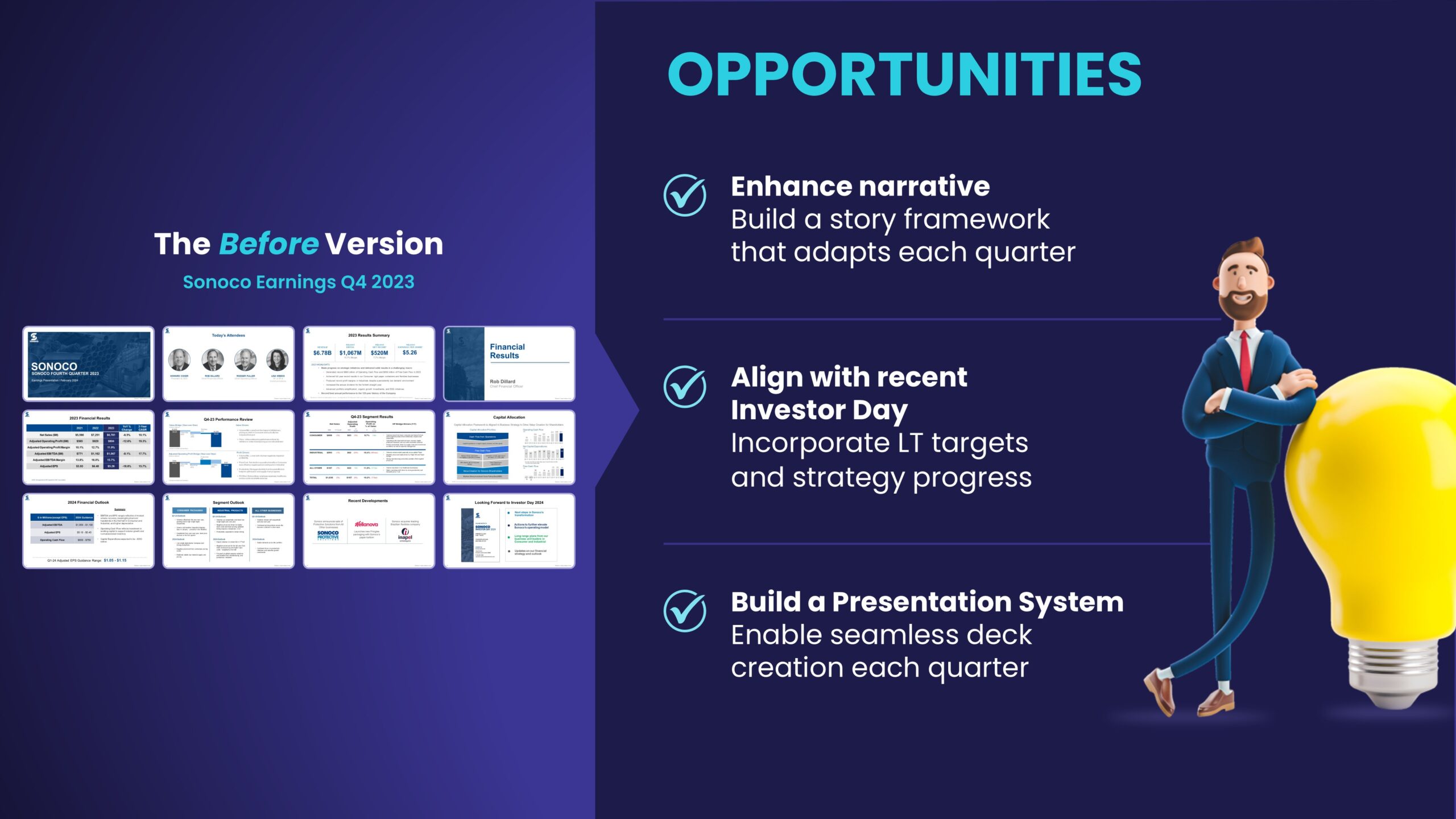
Are your earnings presentations often lengthy and lacking clarity?
You’re not alone. Many presentations lose their essence over time, becoming unwieldy and time-consuming to create.
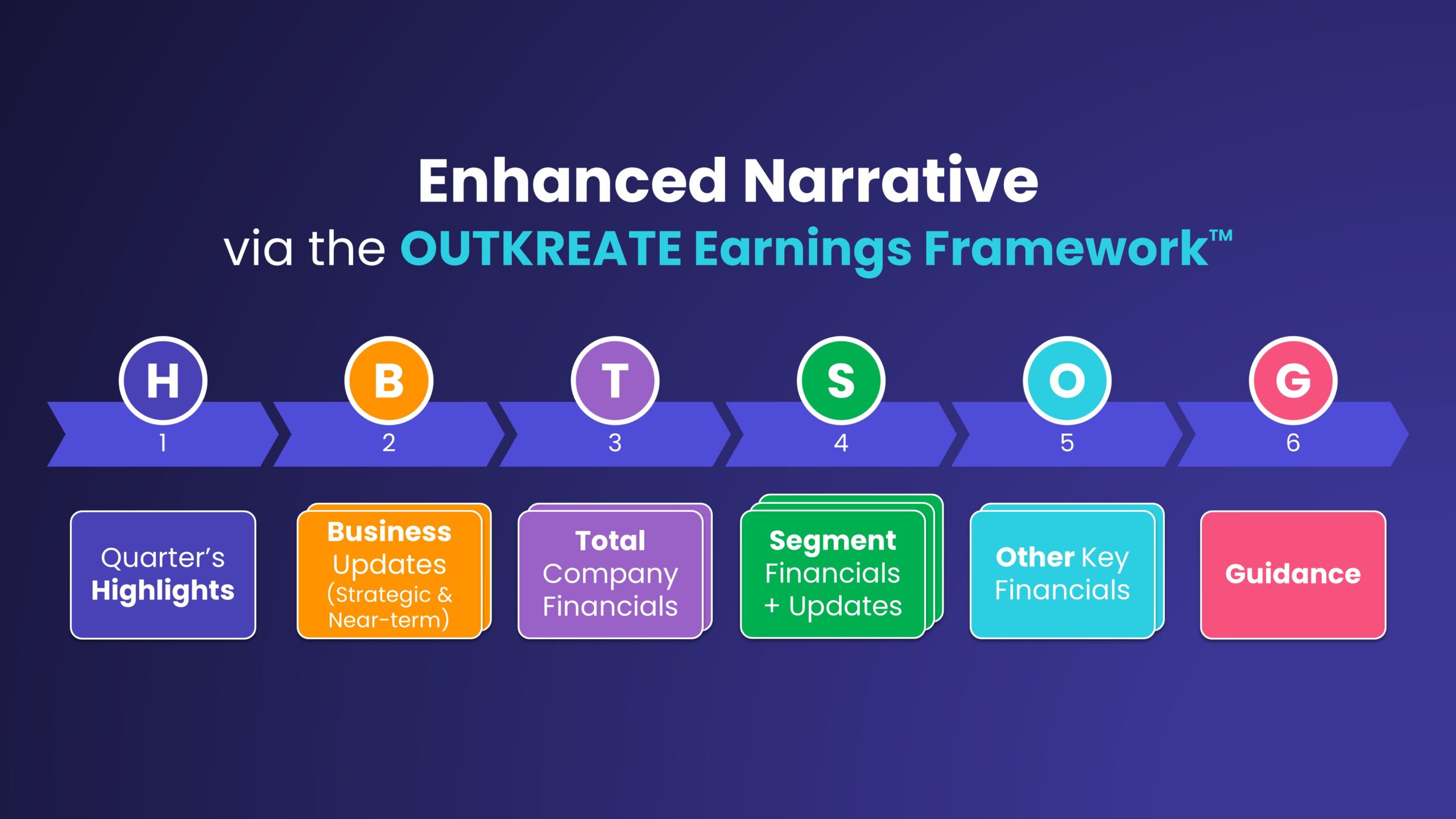
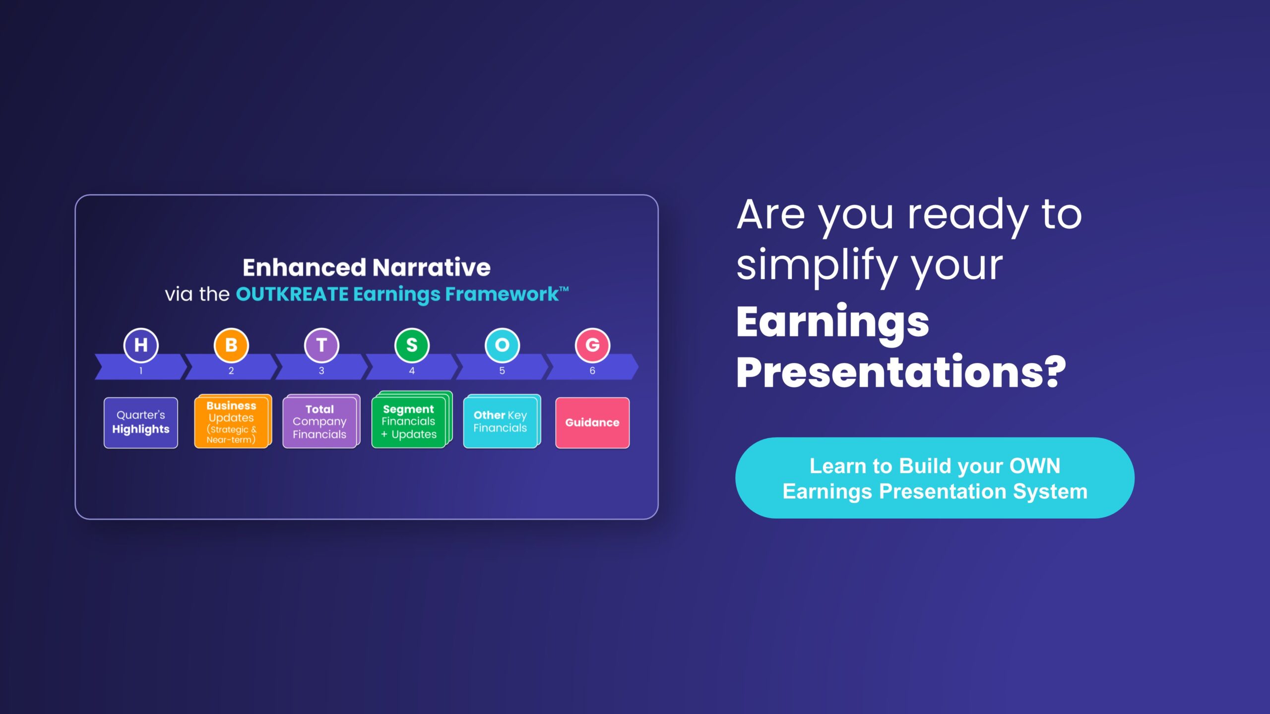
Here’s how we think about earnings content — we’ve developed a framework that’s a good “starting point” for most IROs and you can optimize based on your situation.
Apply the Earnings Presentation framework to enhance messaging and streamline your deck.
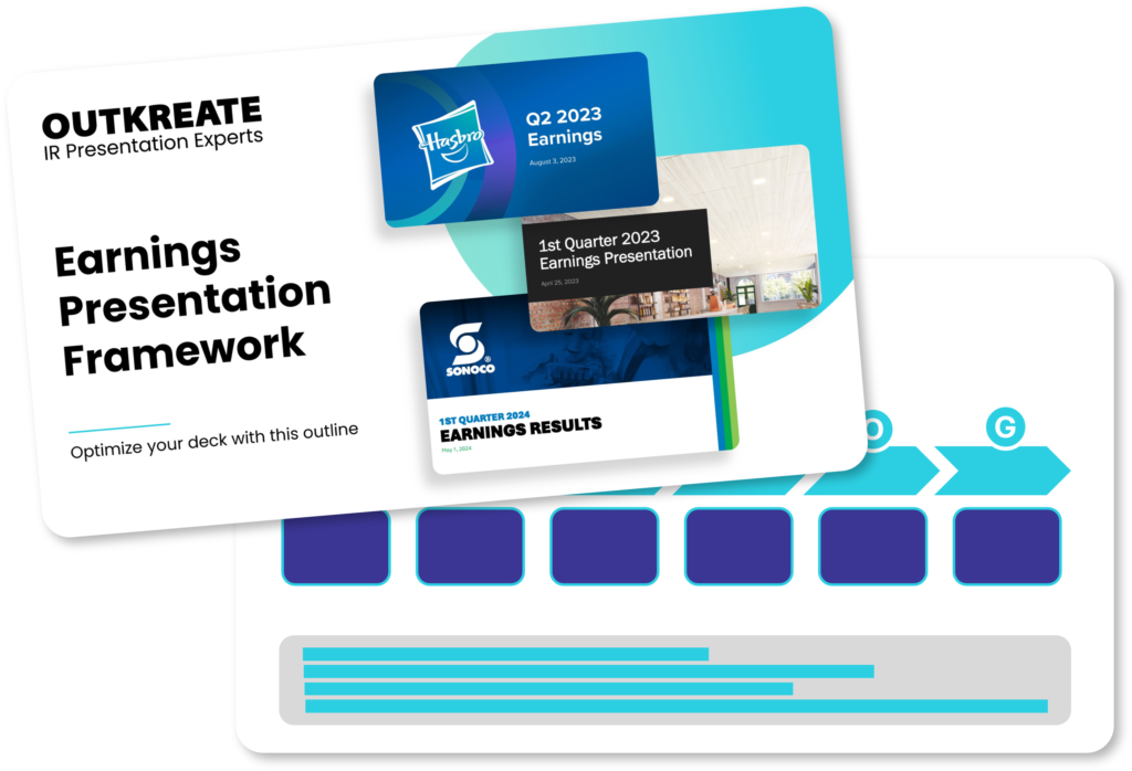
Download and apply to create a more clear and streamlined Earnings Deck for your next quarter
Featured Project
What Makes a Great Earnings Deck?
Here’s what the most successful Earnings decks focus on.
Flexible Structure
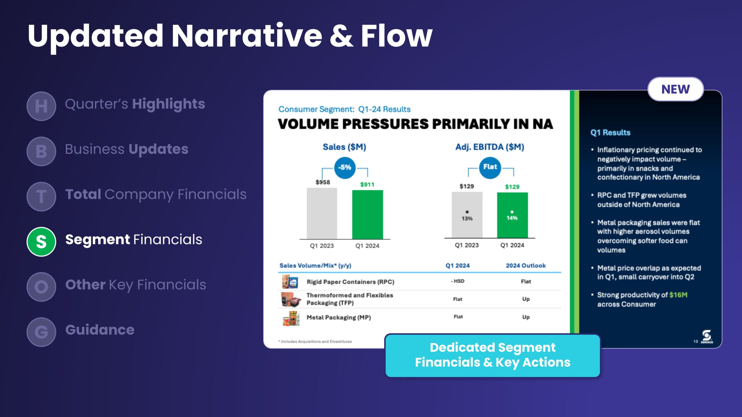
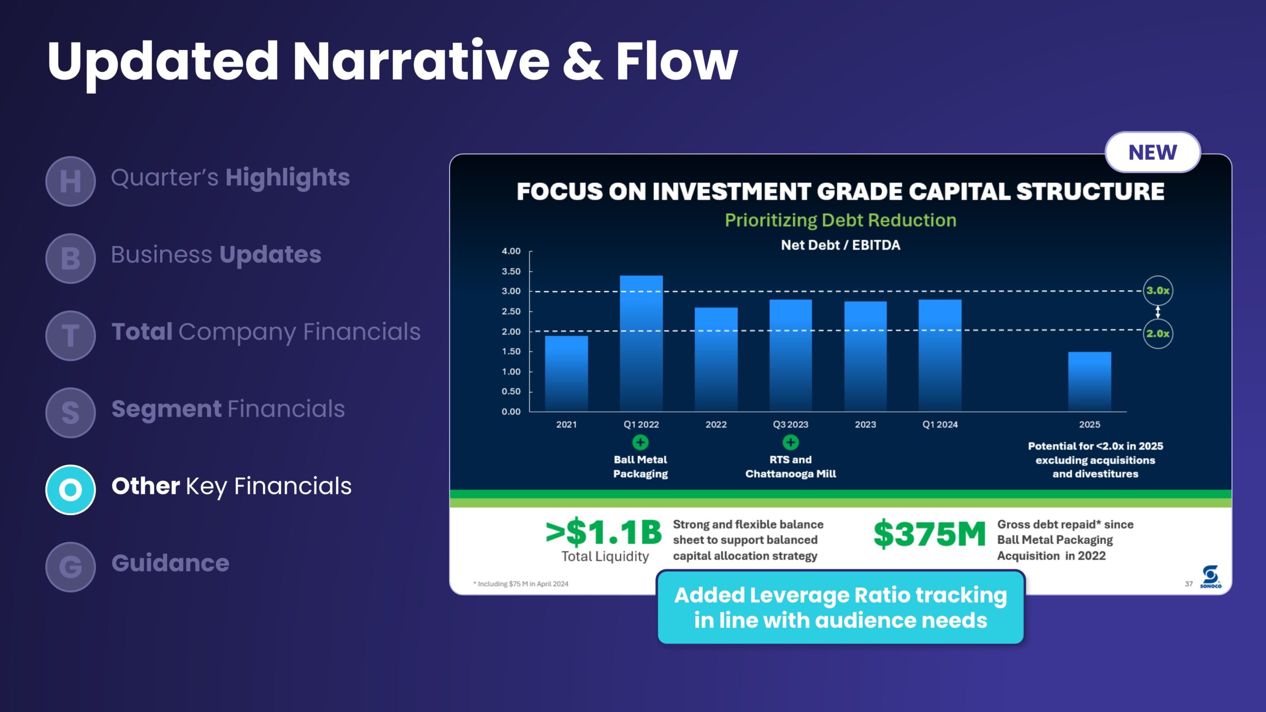
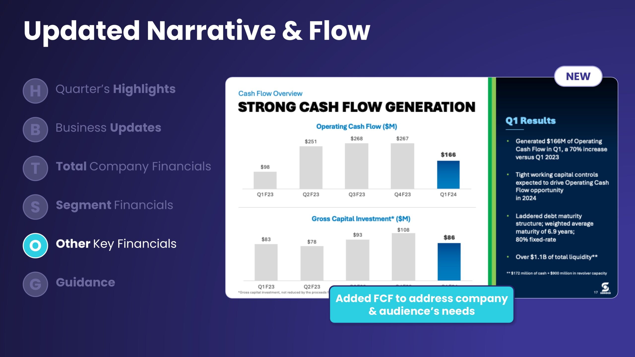
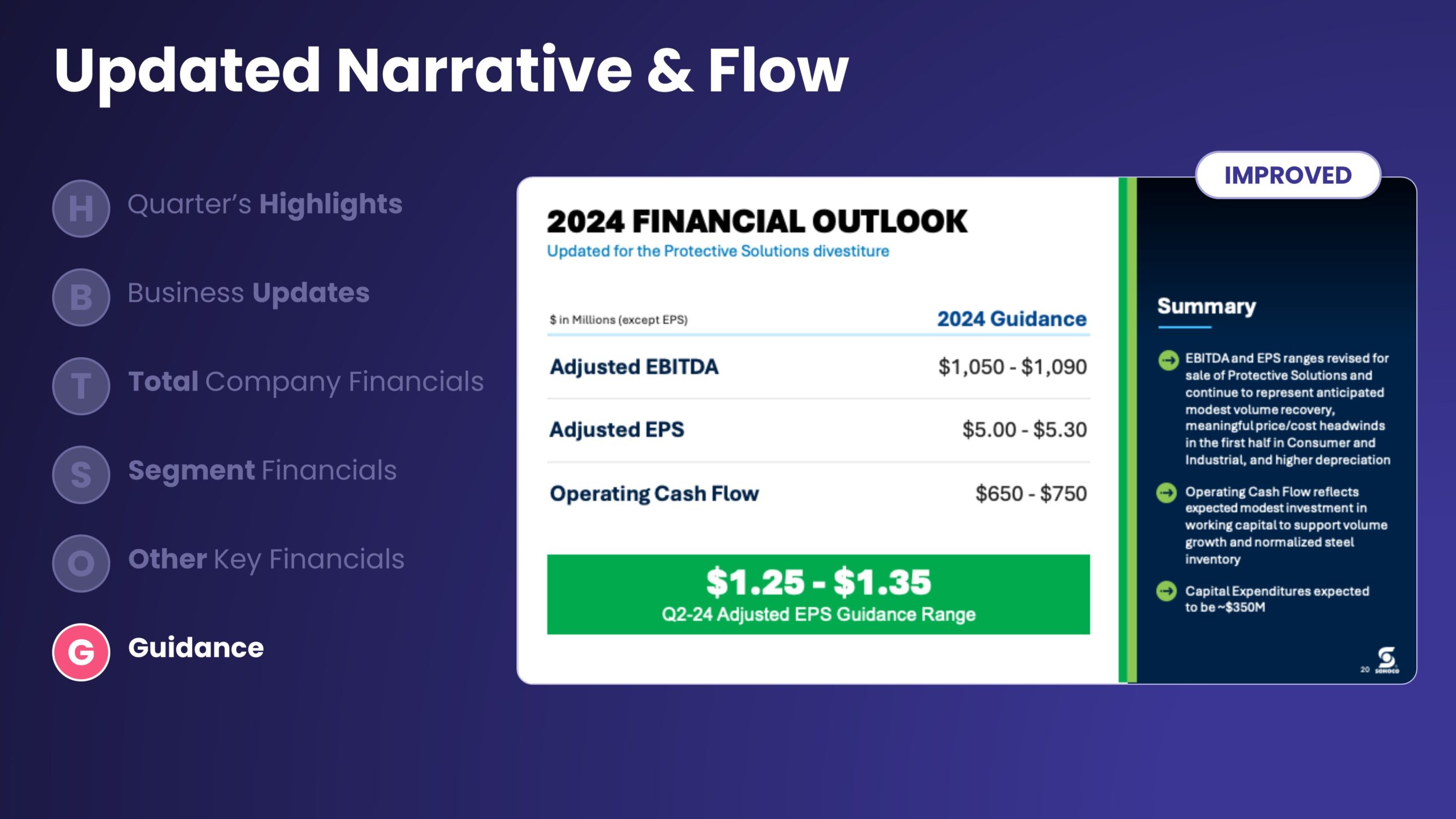
Earnings decks need structure and narrative. A compelling story holds your reader’s attention and helps put your numbers into context. Your Earnings presentation design should also be adaptable to quarterly earnings presentations.
A Balanced Approach to Data
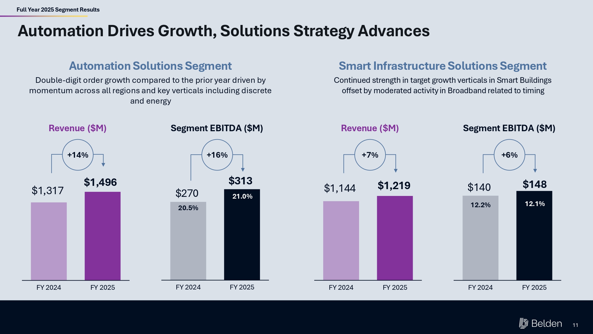
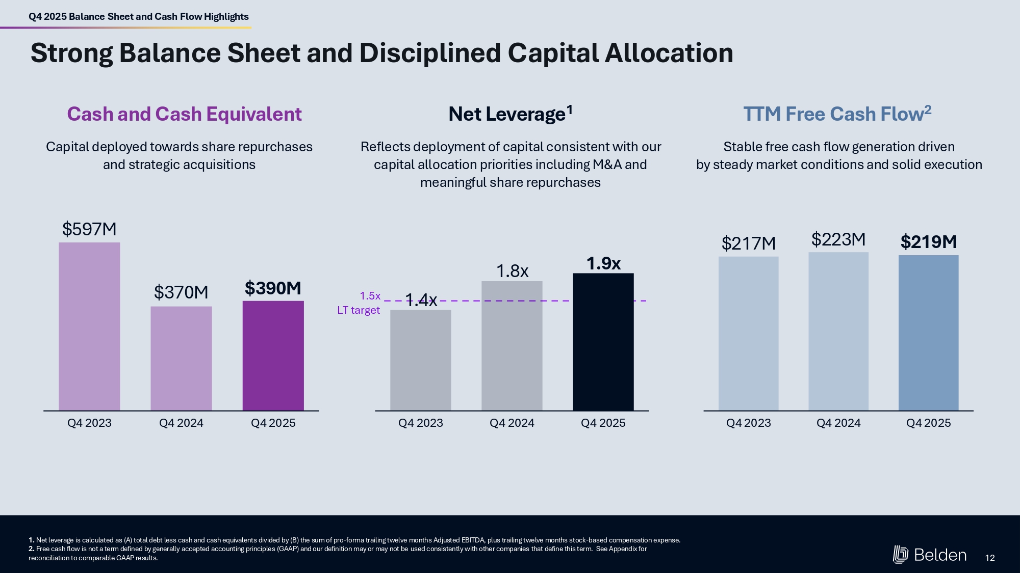
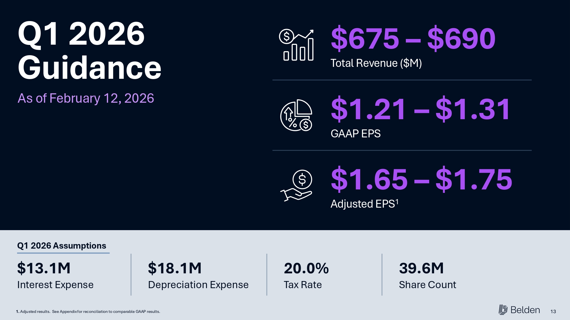
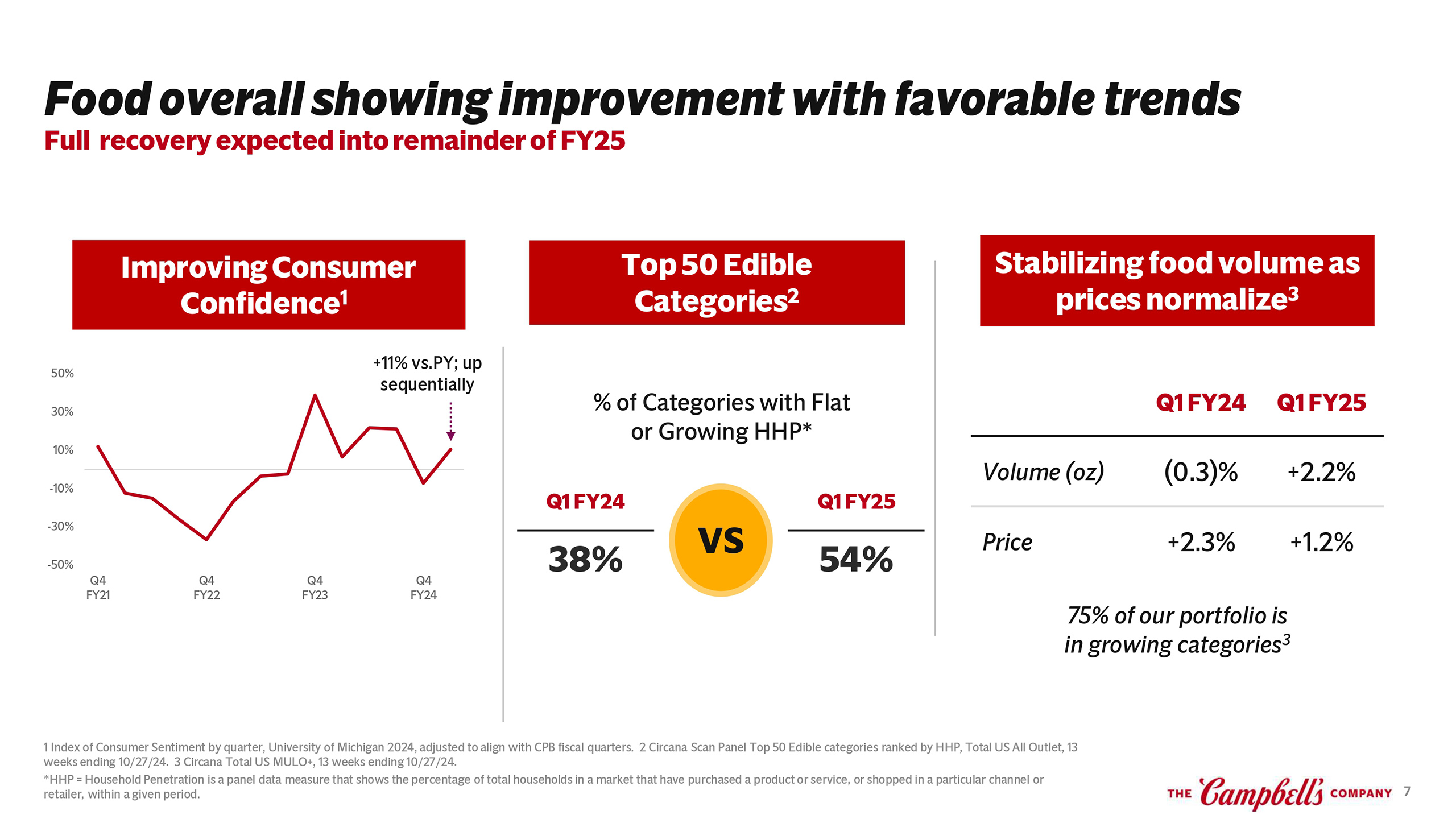
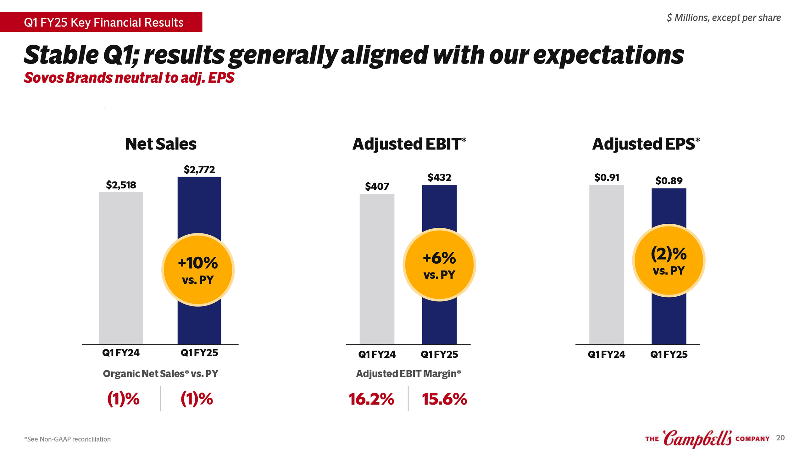
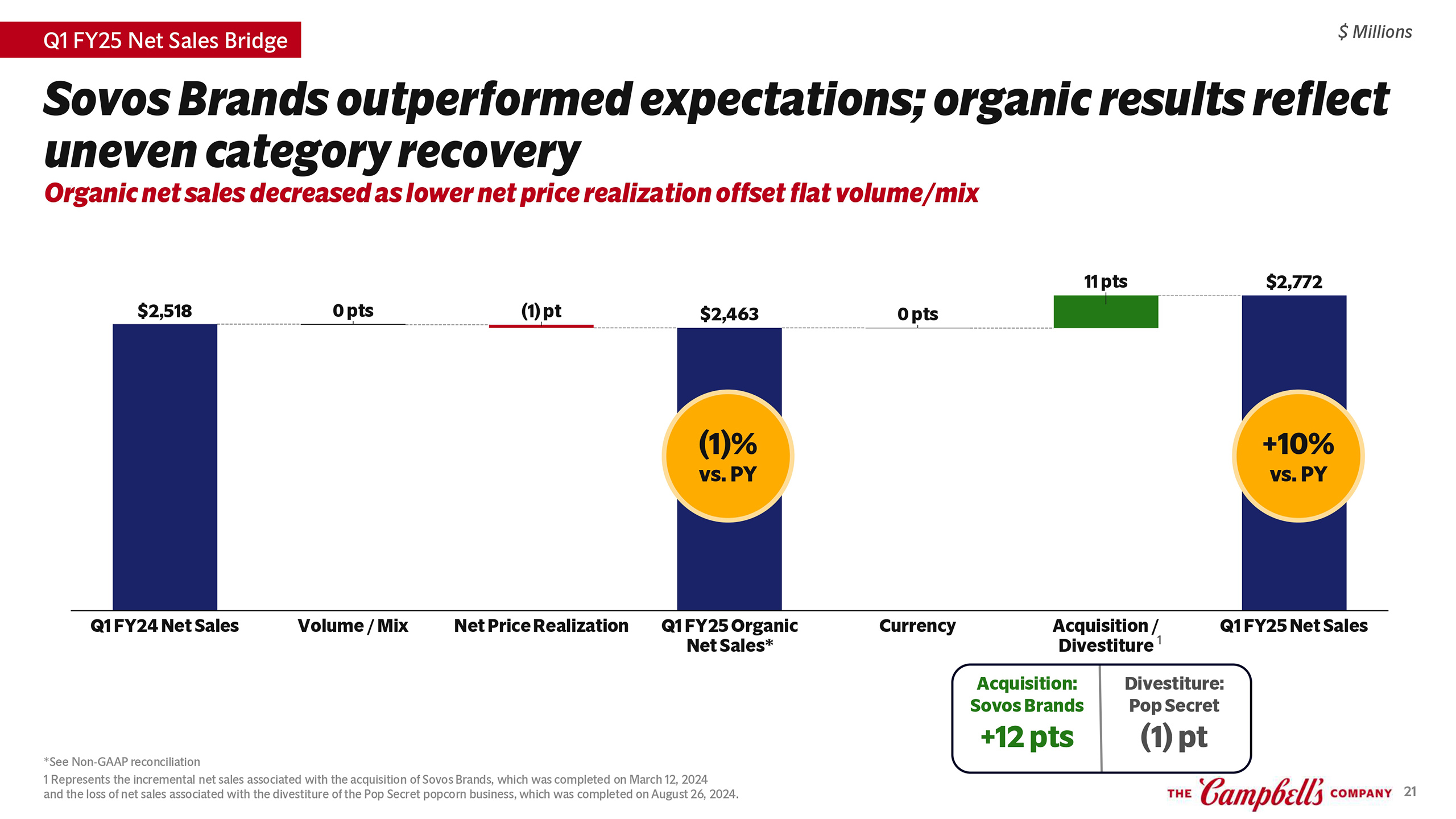
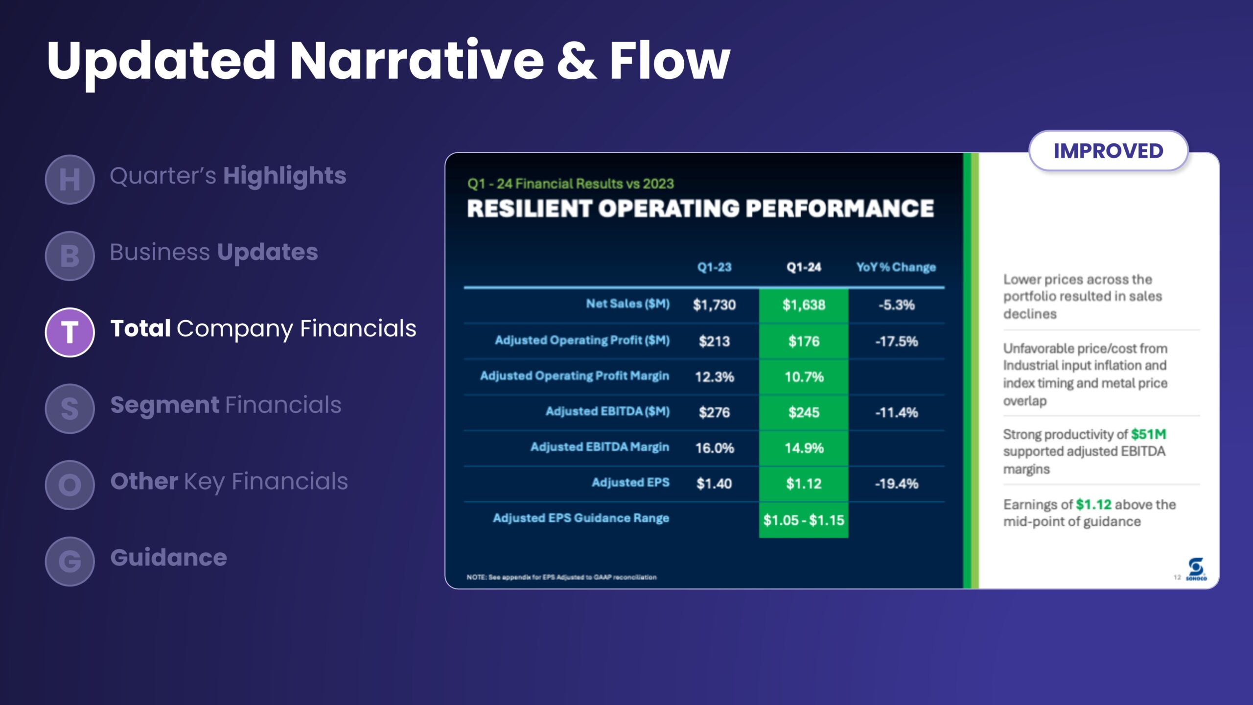
Earnings slides are typically “quant-heavy,” loaded down with numbers. But even in these situations, use a balance of clear headlines and smart data-visualization practices to make things easy to digest for your audiences.
Clear Slides, Short Deck
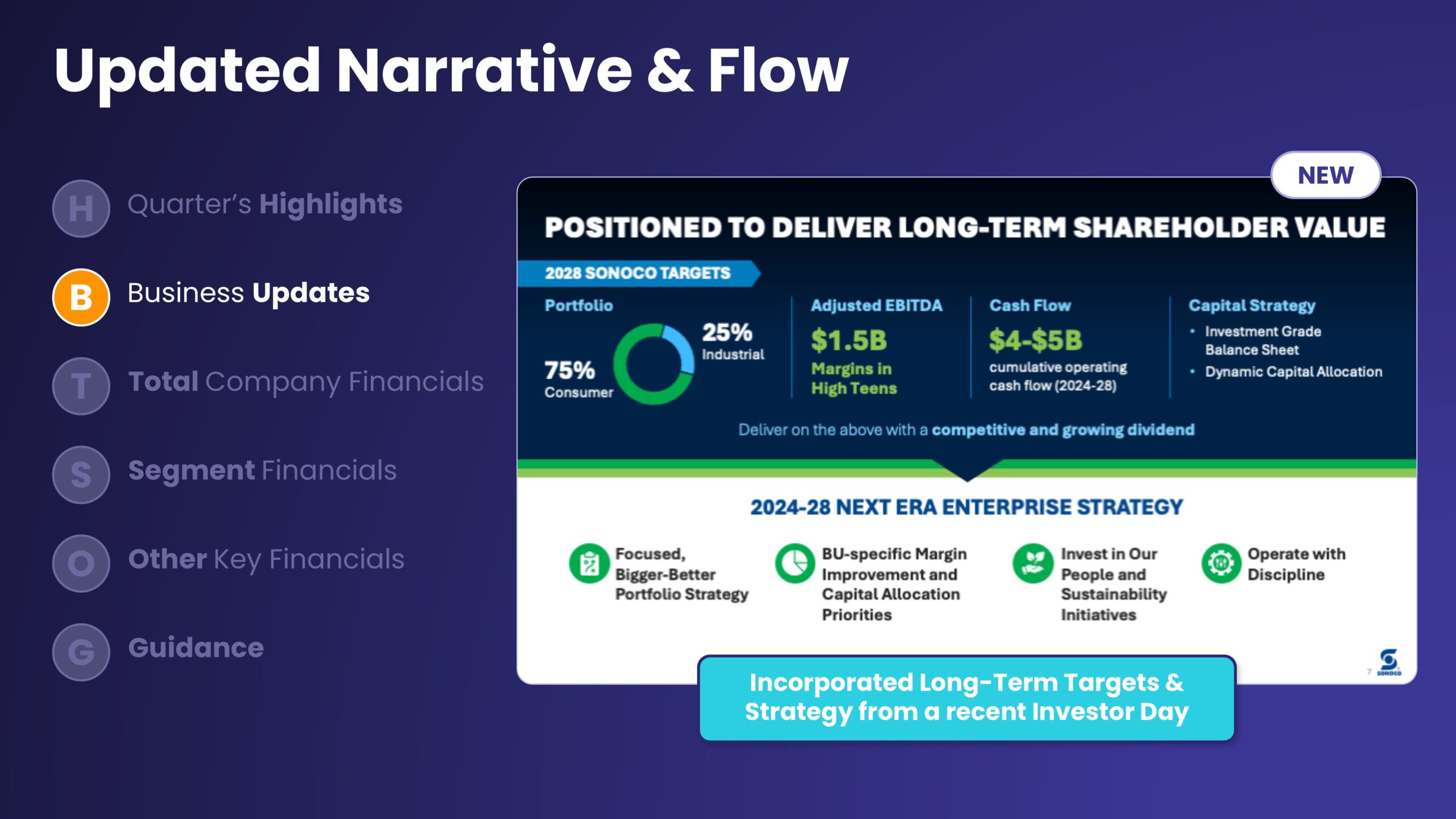
Your audience wants to understand your past quarter’s performance and know where you’re headed. Focus on the numbers that tell the story instead of diluting your message with less important details. Talk about long-term strategy in an Appendix, a separate fact sheet, or a dedicated “Investor Overview” presentation.
How an Earnings Presentation Benefits from Great Design
Effective design doesn’t just improve your presentation. It also enhances communication with investors and ultimately supports your company’s financial performance.
A well-designed Earnings presentation makes it easier for analysts and investors to understand the information you’re presenting. It also sends the message that you care about shareholder communication.
An adaptable Earnings presentation design helps you keep your slides consistent over time, making it easier for readers to compare results from different decks.
An earnings deck that aligns with your company’s brand identity can reinforce your brand image and strengthen your reputation with investors and analysts.
What IROs Say About Working with OUTKREATE
"OUTKREATE redesigned ITT’s earnings release and 2022 investor day presentations. They created a modern, minimalist style for the presentation that matched the simple style our CEO desired. Our stakeholders were impressed by the sleek design and clear messaging. We have since deployed the new look throughout our IR materials. Highly recommend the OUTKREATE team."

"Our partnership with OUTKREATE has resulted in enhanced storytelling for analysts and investors. Their creative thinking and expertise in visual communications was a game-changer as it allowed us to focus our time on the message instead of the visuals."

"For AWI’s 2022 Investor Day, OUTKREATE delivered slides that were clear and visually engaging, and successfully communicated to our audiences. With OUTKREATE doing the heavy-lifting on slide-design, my small team was able to work on higher-value tasks -- resulting in a successful Investor Day."

Common Earnings Presentation Mistakes to Avoid
It’s easy to focus on the wrong areas when designing an Earnings deck.
Here are some common Earnings presentation design mistakes.
Most Earnings presentations have no structure. They’re a mix of standalone charts and graphs—with few cues to help the audience follow along. This jumble makes it easy for your message to get lost.
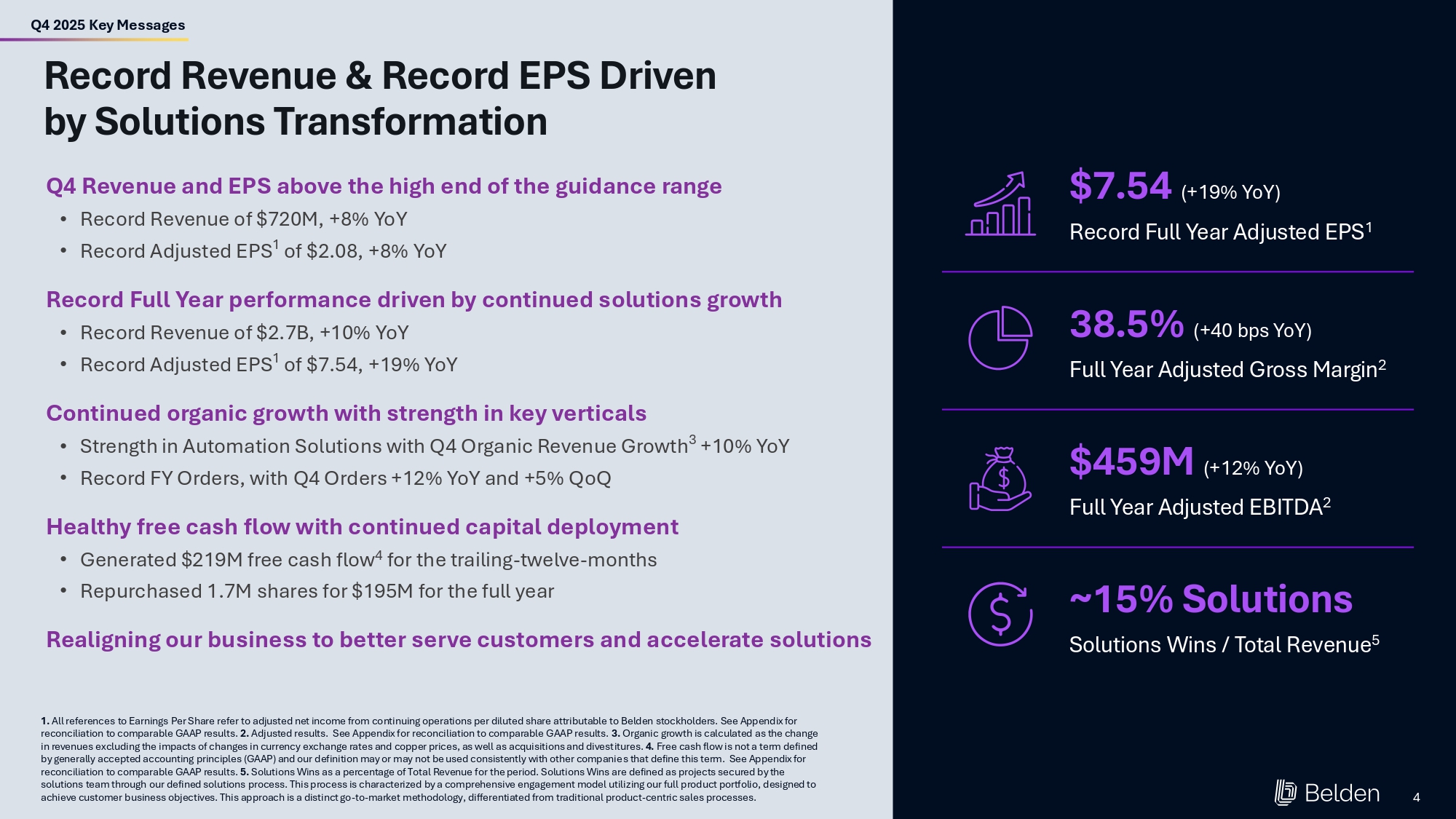
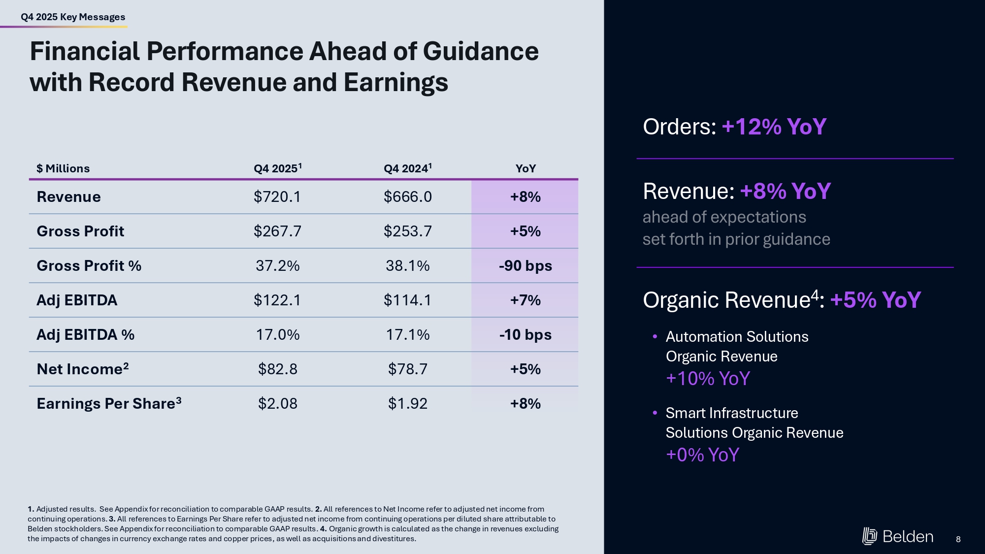
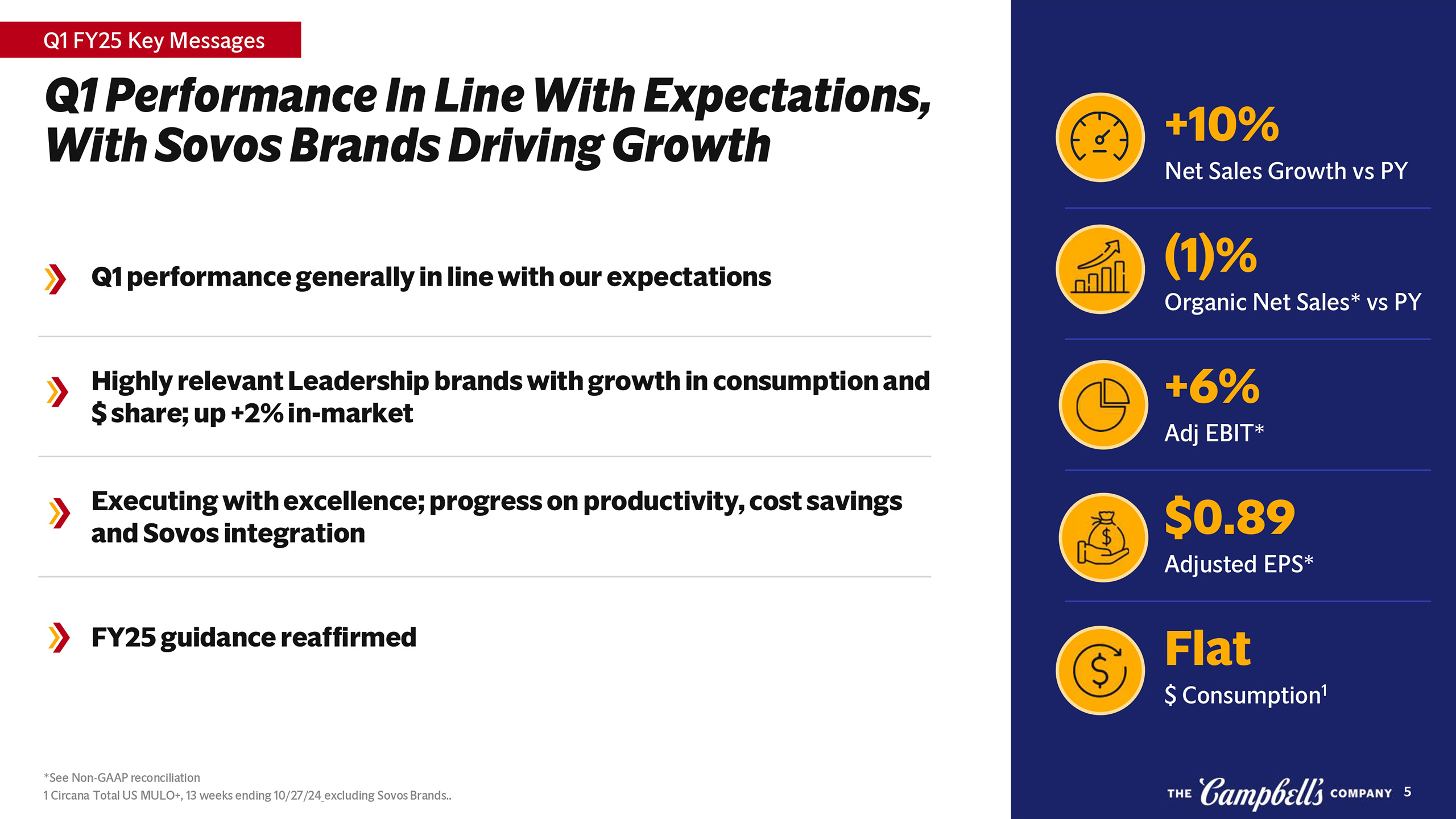
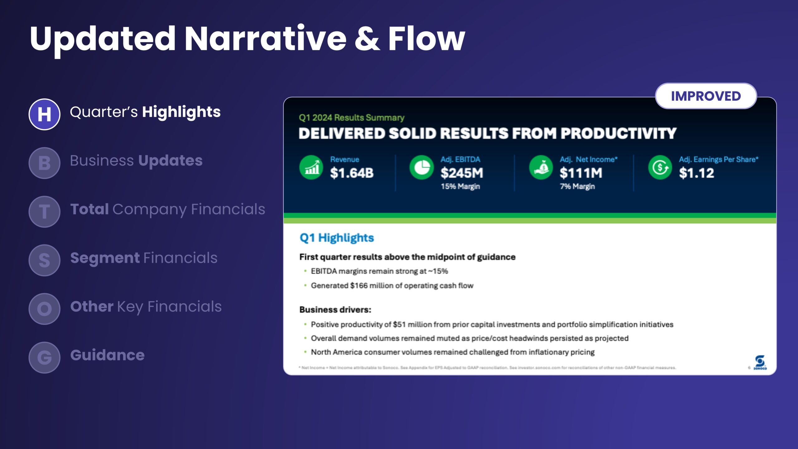
A “Key Messages” slide that provides last quarter’s highlights at the beginning of your presentation is critical. This slide helps set the stage for the rest of your presentation, telling the audience what to pay attention to as you move through the rest of the slides.
Remember, less is more. It can be tempting to pack your slides with information and fire it out to investors and analysts after an earnings call. Instead, focus on the fewer, bigger, better messages.
Learn More About How We Create Impactful Investor Presentations
To view samples of our Earnings presentation designs and learn more about how we work, download the OUTKREATE IR Solutions Deck.
Download IR Solutions Deck

How We Partner with IROs to Elevate Earnings Calls
We’ll discuss any issues you’re having with your Earnings slides. Then we typically move through these stages.
To help you most effectively, we need to understand your situation. We’ll ask about your goals for your Earnings presentations and which key messages you want to convey. We’ll also dive into the common questions you’re getting from analysts, and talk about any issues you’ve been having as you build out your Earnings slides.
Next, we’ll build out your Key Messages slide. This cornerstone slide sets the tone and messaging for the rest of the presentation. As a part of this process, we’ll recommend a flow and structure for the whole deck.
As presentation specialists, we can optimize each aspect of your Earnings presentation design to maximize its impact. We know exactly how to turn data-heavy slides into visually engaging, human-centered designs.
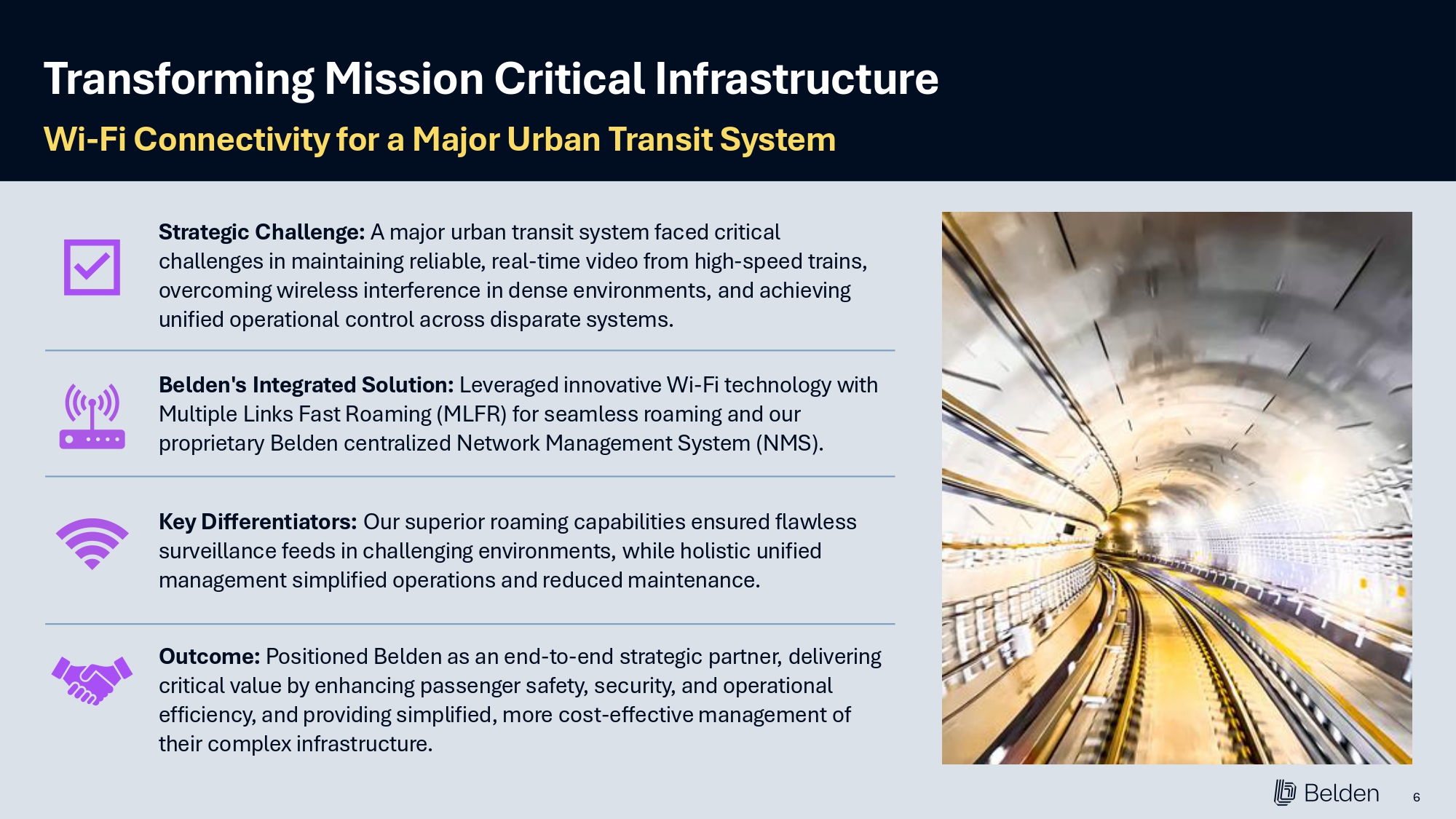
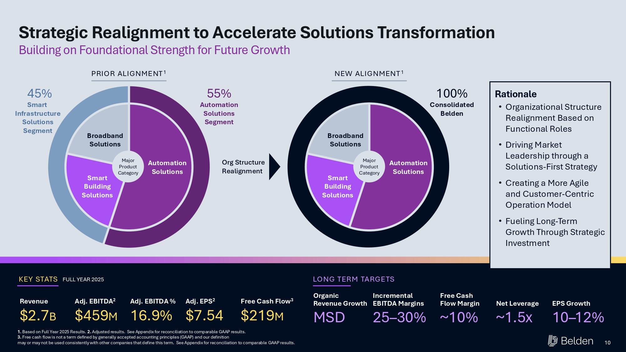
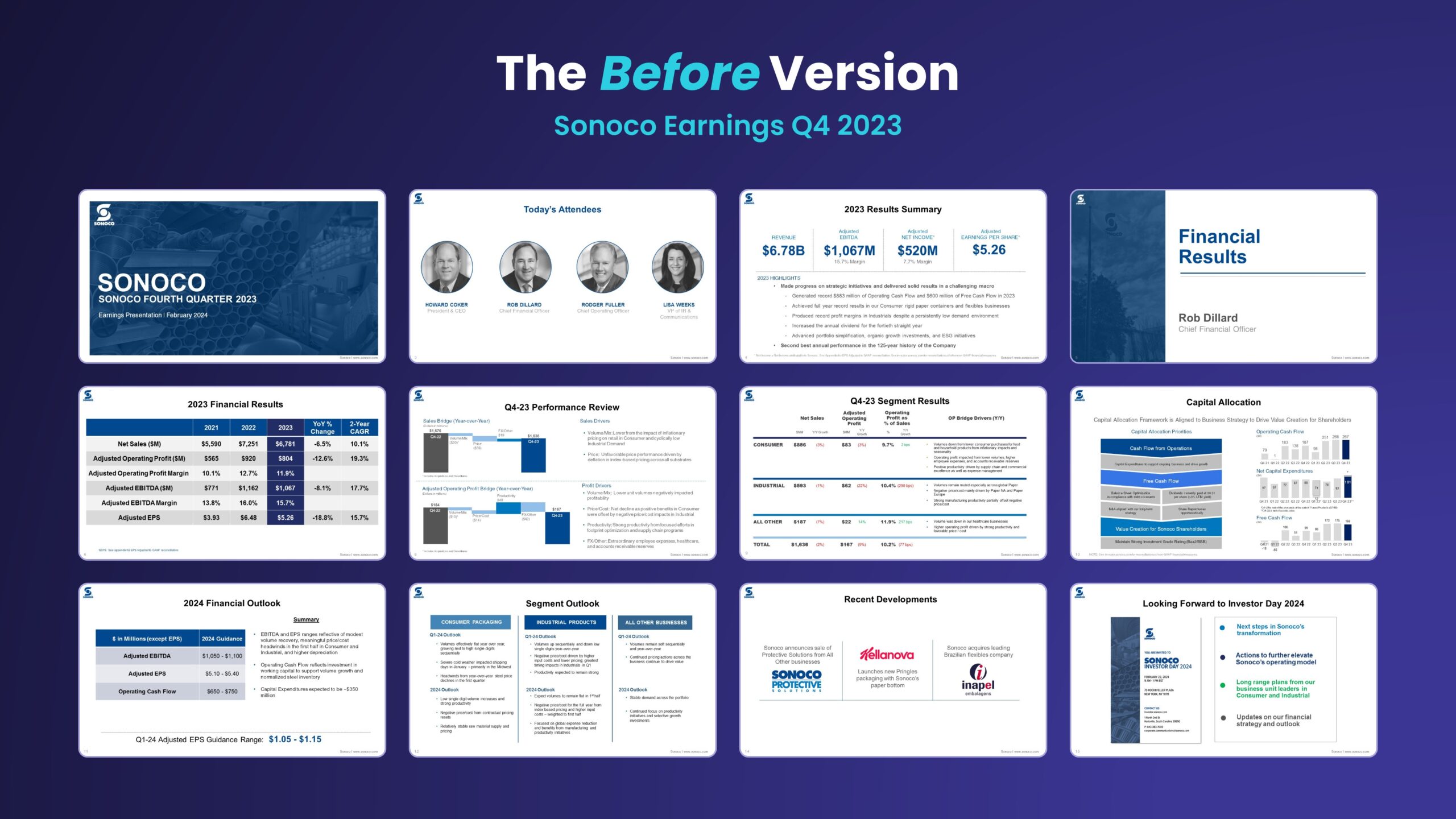
We designed an upgraded Earnings presentation for a global manufacturing leader. They wanted to upgrade the look of their slide decks ahead of an upcoming Investor Day event.
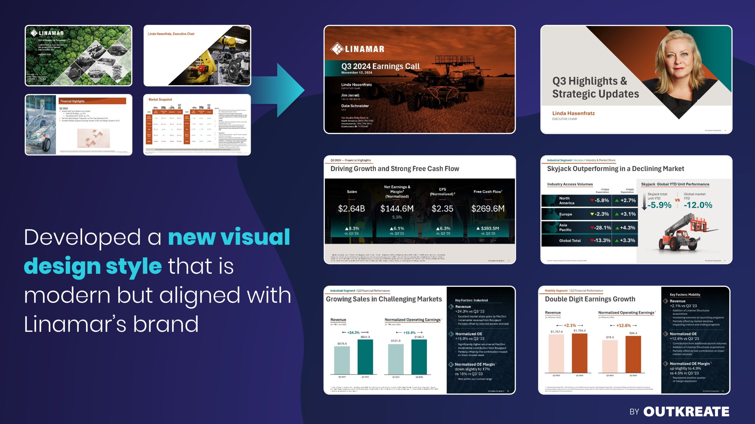
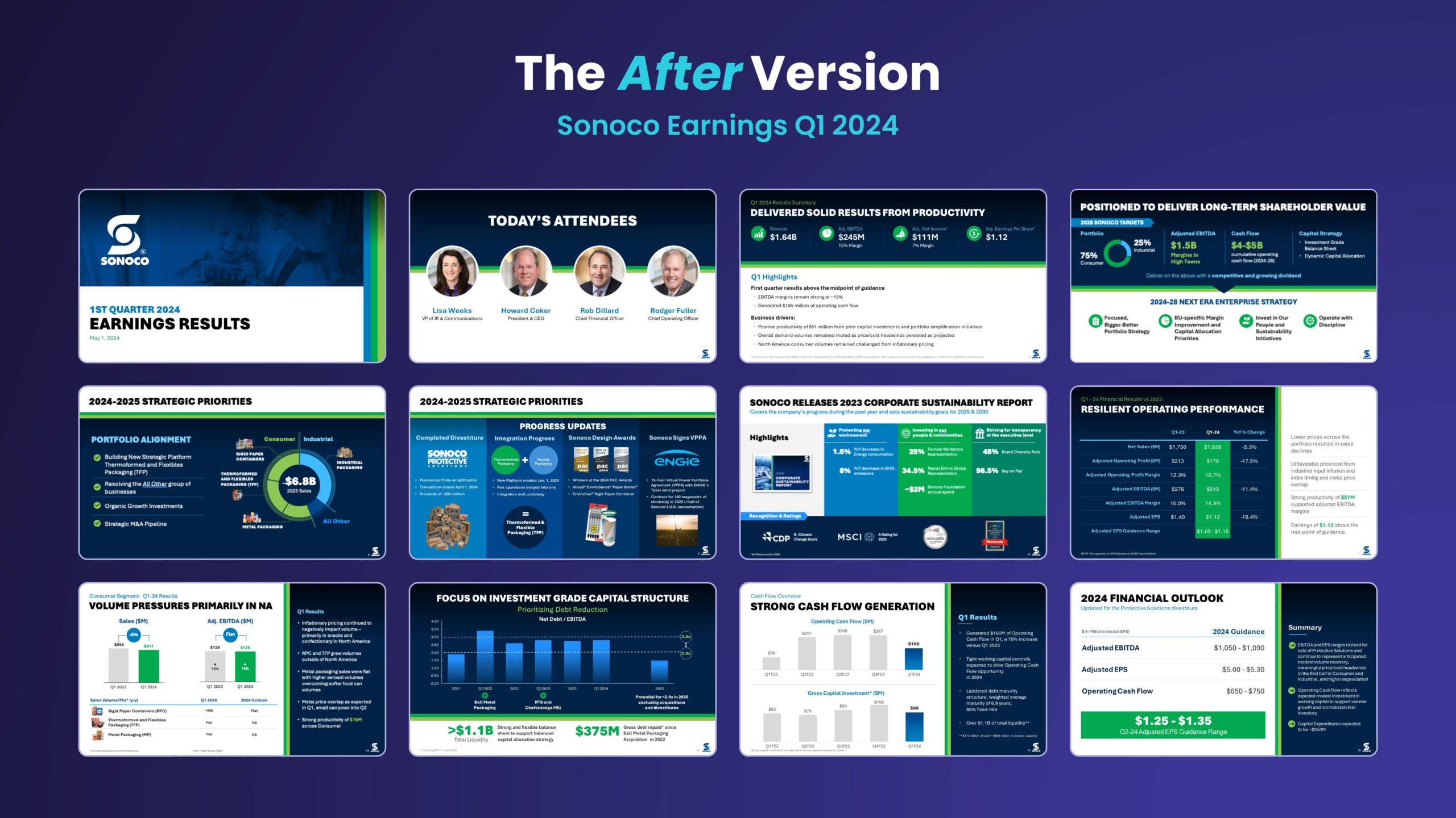
The client’s new CEO wanted a more minimalist “Scandinavian” look for their Earnings presentation. We upgraded the presentation from a dated design to a more modern, clean, minimalist style. We also worked with the client to improve the content.
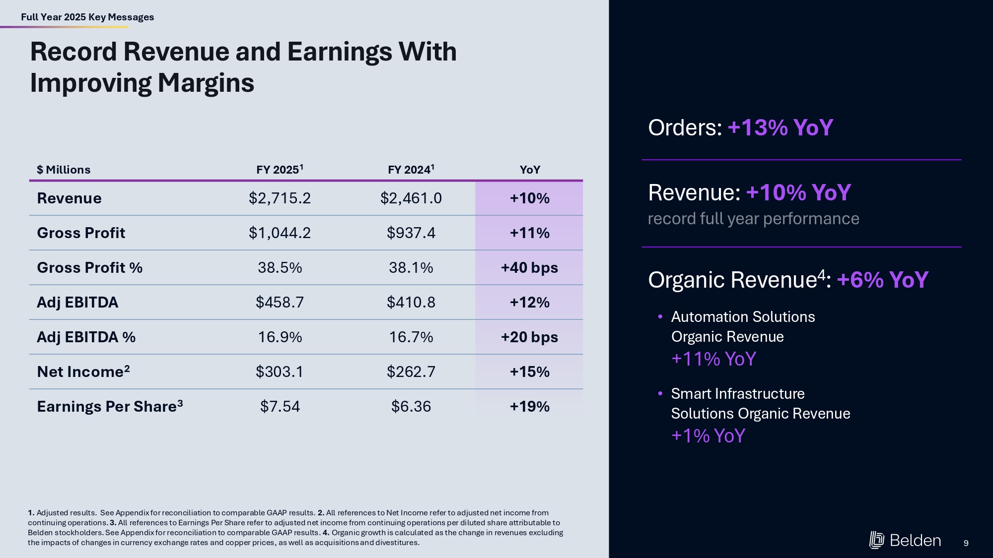
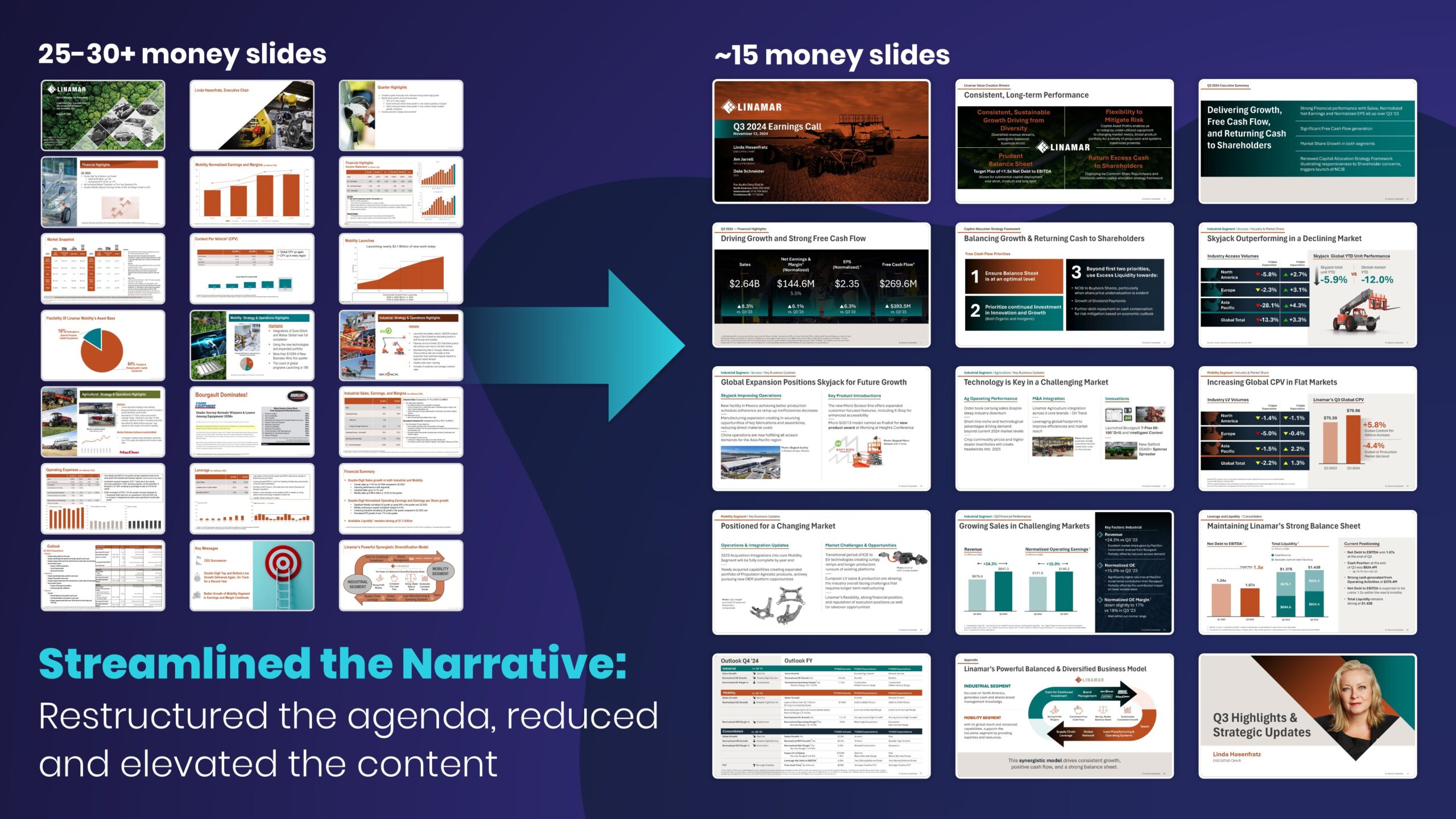
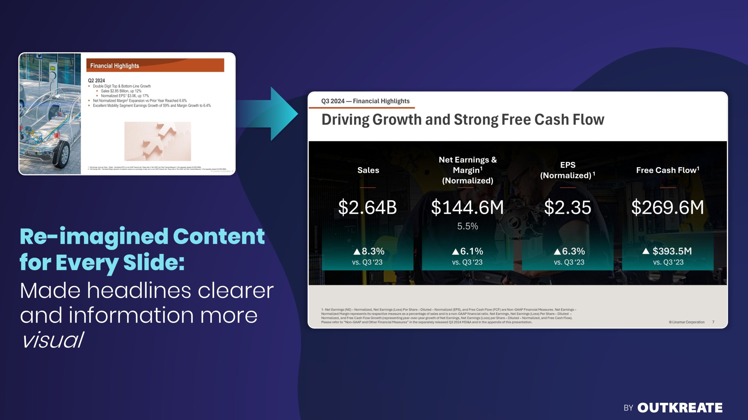
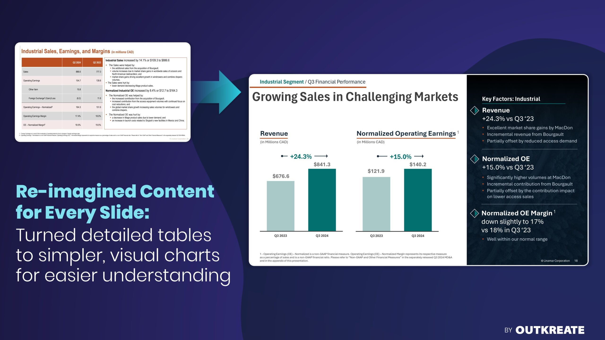
By reducing the amount of information on each slide, we helped convey the client’s message more clearly and impactfully. We also added easy-to-digest visuals to help the audience make sense of the data being presented.
We also designed the new version of the Earnings presentation within an edit-friendly PowerPoint template, allowing the IR team to update slides effortlessly in future quarters.
After working together on the Earnings deck, the Investor Relations Officer hired us to design the company’s Investor Day presentation. This project was itself a resounding success, garnering a nomination for best Investor Day event by IR Magazine.
Official Sponsors


Do You Want to Create More Impact on Your Next Earnings Call?
To upgrade your high-stakes Investor materials, request an OUTKREATE Presentation Assessment. This consultation is exclusively for Public Company IROs.
We’ll walk through your Earnings Presentation in a complimentary 45-minute call. You’ll get objective, actionable feedback that will help you communicate your message more effectively.

Earnings Presentation Projects - FAQs
We structure your deck with a clear narrative arc: what you accomplished, why it matters strategically, and what it signals about the future. Instead of reading through line items, your script connects results to competitive wins and long-term value drivers. Analysts stay engaged and ask sharper, forward-looking questions. OUTKREATE works directly with your IR team to balance SEC compliance with an authentic executive voice.
Get ahead of the narrative. Address the miss clearly in prepared remarks, explain the causes, show the actions you’re taking, and reinforce what has not changed in your long-term drivers. We work with teams facing tough quarters to frame the story with transparency and strategic context. Credibility is built through clear thinking, not perfect results.
We build a clear narrative that connects each quarter to your annual guidance and long-term strategy. Every earnings call reinforces Investor Day milestones, tracks strategic priorities, and builds toward the next inflection point. Investors see steady execution against a clear plan. We help keep your messaging consistent all year, from earnings to Investor Day.
Companies like Airbnb, Duolingo, and Netflix use shareholder letters to tell one clear story – narrative-driven, visual, and in the CEO’s voice. Press releases get shorter, prepared remarks get tighter, and some drop the deck entirely. The benefit is a single, cohesive message that investors actually follow. We help IR teams evaluate fit, structure the letter, and make the shift without losing stakeholder confidence.
